 |
 |
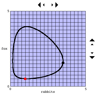
The two graphs above show one model of predator-prey interaction. The graph on the left (with a blue background) shows the phase plane. The graph on the right (with a green background) shows the fox (predator) and rabbit (prey) populations as functions of time. The initial values are indicated by a red square on the phase plane and along the vertical axis on the right graph. You can click anyplace on the right graph to focus on a particular time. In the graph above we focus on the time t = 3.2. That time is indicated by a vertical bar on the right graph and, more importantly, by a large black dot on the phase plane. Notice that at this particular time the rabbit population is at a minimum and the fox population is between its minimum and maximum.
Assignment: For each of the phase planes below, click at two different points on the right graph in the applet above corresponding to that point. Note you may not be able to hit these points exactly.
|
|
You can change the initial values by clicking at the point on the phase plane that represents the new initial value. You can fine tune your selection by using the left-right arrows above the phase plane and the up-down arrows to the right of the phase plane. The smaller arrows change the initial values one pixel at time.
Assignment: Describe what happens when both populations start at 1.
Assignment: Try to locate the equilibrium.
Assignment: Compare this model with another predator-prey model. This new model will open in a second window. Arrange the two windows so that you can easily move back-and-forth between them, comparing the two models.