The Consumer Price Index and Inflation
 The Consumer Price Index affects the wages of 2 million workers covered by collective bargaining, the payments to 48.4 million people on Social Security, food stamps for 19.8 million people, and the cost of lunches at school for 26.5 million children. It is used to measure inflation.
The US Department of Labor's Bureau of Labor Statistics makes the index, using the average change in prices paid by urban consumers for a fixed set of goods and services. Categories include food and beverages, housing, and clothing.
In this module we explore how to find the Index on the Internet, convert its history to a table in Microsoft Excel®, graph the data, fit an exponential curve to the data, adjust prices for inflation, and calculate the rate of inflation. The methods can be adapted for other spreadsheets -- the figures and tables will show what functions are needed. Knowledge of college algebra and statistics is helpful but not required.
Acknowledgments: The graphic on this page is clip art copied from The Voice of Agriculture Newsroom, Vol. 77, No. 11, 1998. I wish to thank Editor David A. Smith, Ken Steward and other employees of the Bureau of Labor Statistics, and the anonymous referees for helpful suggestions and encouragement in the preparation of this module.
Published May, 2003
© 2003, Elizabeth B. Appelbaum
The Consumer Price Index and Inflation - Introduction
The Consumer Price Index affects the wages of 2 million workers covered by collective bargaining, the payments to 48.4 million people on Social Security, food stamps for 19.8 million people, and the cost of lunches at school for 26.5 million children. It is used to measure inflation.
The US Department of Labor's Bureau of Labor Statistics makes the index, using the average change in prices paid by urban consumers for a fixed set of goods and services. Categories include food and beverages, housing, and clothing.
In this module we explore how to find the Index on the Internet, convert its history to a table in Microsoft Excel®, graph the data, fit an exponential curve to the data, adjust prices for inflation, and calculate the rate of inflation. The methods can be adapted for other spreadsheets -- the figures and tables will show what functions are needed. Knowledge of college algebra and statistics is helpful but not required.
Acknowledgments: The graphic on this page is clip art copied from The Voice of Agriculture Newsroom, Vol. 77, No. 11, 1998. I wish to thank Editor David A. Smith, Ken Steward and other employees of the Bureau of Labor Statistics, and the anonymous referees for helpful suggestions and encouragement in the preparation of this module.
Published May, 2003
© 2003, Elizabeth B. Appelbaum
The Consumer Price Index and Inflation - Get CPI Data from the Web and into a Spreadsheet
Note: Each link to an external Web site will open a new window. You can return to the module either by closing that window or selecting this one.
Visit the Web site of the Bureau of Labor Statistics. While on that page, carry out the following steps.
- Select Get Detailed Statistics at the top of the page.
- Scroll down to CPI-All Urban Consumers (Current Series).
- a) If you have a Java-enabled browser, select Create Customized Tables (One Screen) -- see Figure 1.

Figure 1. Get Detailed Statistics. U. S. Department of Labor, Bureau of Labor Statistics. Accessed March 3, 2003.
Then select:
- Area: U.S. city average
- Select one or more items: All items
- Not Seasonally Adjusted
- Get Data
b) Or use this method, whether or not you have a Java browser: Select:
- Most Requested Statistics
- US All Items, 1982-84 = 100
- Retrieve Data
- Area: U.S. city average
- In either case (3a) or (3b), select More Formatting Options, All Years, Annual Data, and Retrieve Data.
- A table results in HTML format. Select all the data in the table, beginning with the words Year and Annual and ending with 2002, or the last year shown. Copy the data.
- If your computer does not have much memory, close all open screens .
- Open Microsoft Excel, and paste the material onto a worksheet. The result, in part, is shown in Figure 2.
Figure 2. Part of Consumer Price Index Table, as downloaded from Bureau of Labor Statistics. Accessed March 3, 2003.

Note: This method of getting the table into Excel may not work with Macintosh computers. In that case, click here.
The Bureau changes its Web site occasionally. If you have trouble getting the information, write or call the Bureau. On the home page, under “People are asking . . .” click “Send us your question” to e-mail a question to the Bureau. Also on the home page is a list of information offices for the bureau.
The Consumer Price Index and Inflation - Simplify the Table
-
 The downloaded table is shown in part at the right, copied from Figure 2 in Part 1 of the module. If your data are not in columns A and B starting with the headers "Year" and "Annual", as shown here, copy your data columns (from the headers through the last year shown) and paste them into a blank worksheet in this position.
- In Column B, choose Insert to make a new column to the left of Column B.
- In the new cell B1 write Years Since 1913.If this label overflows the cell, highlight the row. Choose Format, Cell, Alignment, and Wrap Text.
- In cell B2 write 0, and in cell B3 write 1. Highlight these two cells. Move the cursor to the lower right corner of the highlighted rectangle, so the cursor becomes a cross. Drag down the column to get the sequence in Column B: 0, 1, 2, 3, 4, and so on.
- In Column C, replace the word Annual with Annual CPI.
The resulting table should resemble the one shown (in part) in Figure 3.
Figure 3. Part of Consumer Price Index Table with new column B inserted |
 |
The Consumer Price Index and Inflation - Make the Graph
Figure 4. The first step in making a graph from your current table.

- In your table select Columns B and C. Click the Chart icon (circled in Figure 4).
-
Use the Chart Wizard:
- Step 1. Click XY (Scatter). For Chart Subtype, click the smooth curves, highlighted in Figure 4. Click Next.
- Step 2. Click Next again.
- Step 3. Insert a title for the graph and for each axis. For Gridlines, choose Major gridlines for each axis (see Figure 5). Click Next.
Figure 5. Choosing gridlines.

- Step 4. Request the chart As New Sheet. Click Finish. Figure 6 shows the complete graph.
Figure 6. The finished graph.

The Consumer Price Index and Inflation - Insert an Exponential Trend Curve
In this section we add a "best-fitting" exponential curve to the data plot and interpret this exponential trend curve.
-
At the top of the window, click Chart, Add Trendline, and Exponential.
- Click Options. Select Display R squared value on chart and Display equation on chart. Click OK. The resulting curve is an exponential curve fitting the data. Figure 7 shows what your Excel chart might look like. For tips on improving the graph, click here.
Figure 7. A plot of historic CPI data with exponential trend curve.

For CPI data from 1913 through 2002, the equation of the fitted curve is  . Your equation may be slightly different if your table includes different data. Here, x is the number of years since 1913, and y is the value of the Consumer Price Index. The statistical term R 2 is the coefficient of determination, which in this case is 0.9101. This statistic varies between 0 and 1 and measures how well a trend curve explains the data. An R 2 greater than 0.9 suggests a good fit, but the picture shows some obvious problems with the fit. In the next two paragraphs -- for which a little background in statistics is helpful -- I explain why the high R 2 does not necessarily mean a good fit.
As we will see shortly, the exponential fit is based on fitting a regression line to something. In regression analysis we fit a straight line  to points
  . (The variables x and y here are "generic" -- they are not necessarily our time and CPI variables.) For each value of the independent variable x and the dependent variable y, we may write
  , where m and b are the regression coefficients, and
  (called the residual) is the difference between the actual and fitted values of y. The assumptions of regression analysis are that the values of for all values of x are independent and normally distributed with mean 0 and variance the same for every x. If these assumptions are correct, we should see the data points cluster about the regression line, bouncing erratically above and below it.
For fitting an exponential curve to data, we make corresponding assumptions about the logarithm of y. We fit a regression line to the points ![]() , which should then cluster and bounce about the line, if our assumptions are correct. Then we expect the points
, which should then cluster and bounce about the line, if our assumptions are correct. Then we expect the points ![]() to cluster and bounce about the corresponding exponential curve. But the CPI points are above the exponential curve until year 18 (1931) and again after year 66 (1979). In between, they are below the curve. This pattern displays a strong dependence of values of on nearby values, not the random fluctuations that we expect. It follows that the assumptions for a regression fit are not satisfied by the CPI data.
to cluster and bounce about the corresponding exponential curve. But the CPI points are above the exponential curve until year 18 (1931) and again after year 66 (1979). In between, they are below the curve. This pattern displays a strong dependence of values of on nearby values, not the random fluctuations that we expect. It follows that the assumptions for a regression fit are not satisfied by the CPI data.
Nevertheless, the exponential trend curve does give us a general picture of the growth in CPI over time, and that's the significance of the relatively large R 2. In the next two sections, we will see some algebraic reasons for not placing too much confidence in the trend curve -- in particular, we will see that there is no way to predict inflation accurately. An economist (Haimowitz) notes that governments often manipulate prices. This is certainly the case in controlled economies, but it happens in the U.S. too. This is one of the economic reasons why inflation has often not been exponential. However, learning to fit a curve to data is useful, if only for discerning general trends, and of course you can apply this skill in other situations as well.
The Consumer Price Index and Inflation - Calculate and Graph the Logarithm of the CPI
In the preceding section we observed that the exponential trend curve is determined by doing a linear regression with data points of the form ![]() . We can, of course, do that linear regression directly by taking natural logarithms of the y data. Furthermore, it is often more revealing to work with the logarithm of data than the data itself. The CPI rose from 2.3 in 1913 to 179.9 in 2002, a change of two orders of magnitude. The standard xy-graph does not do justice to the details of change over such a large range. But if we work with logarithms of the CPI, our graph can show details of the entire history. Here is the way to calculate natural logarithms of a data column in Excel:
. We can, of course, do that linear regression directly by taking natural logarithms of the y data. Furthermore, it is often more revealing to work with the logarithm of data than the data itself. The CPI rose from 2.3 in 1913 to 179.9 in 2002, a change of two orders of magnitude. The standard xy-graph does not do justice to the details of change over such a large range. But if we work with logarithms of the CPI, our graph can show details of the entire history. Here is the way to calculate natural logarithms of a data column in Excel:
-
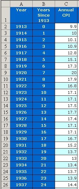
In cell D1 of your current table, write Ln Annual CPI.
- In cell D2 write = ln (C2). (The = symbol is used for any calculation in Excel.) You should see the result 2.292535, the natural logarithm of 9.9 (the number in cell C2). The formula appears at the top of the worksheet, next to the = sign -- see the red rectangle in Figure 8.
Figure 8. The natural logarithm formula.
-
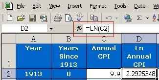
Copy the formula down the page: Click on cell D2. Move the pointer to the lower right corner, so that a cross appears in place of the black box in the lower right corner of Figure 8. Drag the pointer down the column. The natural logarithm is then calculated for cells C3, C4, and so on. The result should look like the table in Figure 9, but extended all the way to the last year in the table.
Figure 9. Logarithms of the Annual CPI data.
To graph the logarithmic data, follow these steps:
-
In the table just made, select Columns B and D: Use the Control key and click Columns B and D. (On a Macintosh computer, use the Apple or Command key.) [If you can't get this to work, click column C and choose Format, Column, and Hide. Then select adjacent Columns B and D with the mouse. You can Unhide Column C when you are done with graphs.]
-
Click the Chart icon, and draw the graph as you did on Page 4.
-
After drawing the graph, click Chart, Add Trendline, Linear.
- Click Options. Select Display R squared value on chart and Display equation on chart. Click OK. The result should resemble Figure 10.
Figure 10. Natural Logarithm of Consumer Price Index and Linear Trend Line

In the preceding section we saw that the exponential trend curve has the formula  . If we take the natural log of the right-hand side of this formula, we find that
 .
.
This last expression is the formula for the regression line in Figure 10 -- which confirms that the exponential trend curve is actually derived from the regression line.
Another way to see a logarithmic plot of the data is to use a logarithmic scale on the vertical axis. To do so, go to the original graph in your worksheet (see Figure 6 or Figure 7). Double-click the vertical axis. Choose Scale and Logarithmic scale
The Consumer Price Index and Inflation - Calculate and Graph Inflation Rates
Any of several statistics can be presented in the media as the "Official CPI." One is the index itself (for all urban consumers), as we have used it in this module. Another is the 12-month percent change, such as from August 2001 to August 2002. The annual inflation rate for a given year (say, 1914) is the percent change from the previous year (1913 in this example). Here is the way to calculate the annual inflation rate for 1914:
-
Calculate the difference in the CPI from 1913 to 1914:
 .
.
- Calculate the ratio of this difference to the CPI in 1913, and multiply by 100 to get a percent:
 .
.
So the inflation rate for 1914 was about 1.0%.
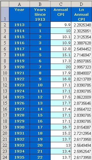
Excel can calculate inflation rates for every year of the CPI except 1913 (when there was no previous year tabulated). In cell E1 of your most recent table (see Figure 9), write Inflation Rate %. In Cell E3 write

The result, approximately 1.0, appears in cell E3. Copy the formula down column E. The result should look like Figure 11. (For tips on making the table more legible, see “Improve the Table.”)
Figure 11. Adding an inflation rate column to the table
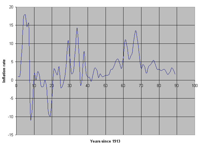
To graph inflation rates, use Columns B and E and continue as on Page 4. (Add a linear trend line if you like.) The result looks like Figure 12, with many fluctuations and a range from -10.5% (1921) to 18.0% (1918).
Figure 12. Annual inflation rates since 1913
You can also get inflation rates and a graph directly from the BLS Web site. Follow the same steps you did in Section 1:
The press often mentions “average inflation rate,” say, for the period 1951 (CPI 26.0) to 2001 (CPI 177.1). This number is not the average of the inflation rates over those years. Instead, it is a percent such that, if the CPI grew at that annual rate, compounded, from 1951 (26.0) to 2001, the same result of 177.1 would occur in 2001. The actual inflation rate fluctuated greatly, as you saw in Figure 12. But suppose it had been 4% (0.04 as a decimal) every year. Then the CPI would have grown by a factor of 1.04 each year, starting at 26.0. After 50 years -- 1951 to 2001 -- the CPI would be  . Since 185 is larger than 177.1, 4% is a little too big. Let's calculate the correct average rate.
Call the decimal rate x. Since the CPI went from 26.0 to 177.1 over a period of 50 years, we know that 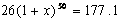 . Thus,
  .
.
- Solve this equation for x. Answer as a percent, rounded to two decimal places. You can either raise each side to the 1/50 power or use logarithms. (Do it both ways to check your work!) You should find that the average inflation rate is a little less than 4%.
As is often the case with averages, the actual rates in this 50-year period do not cluster around the average. They vary from –0.4% (1955) to 13.5% (1980). See “Inflation and Deflation” for more information about positive and negative growth rates in the CPI.
The Consumer Price Index and Inflation - Adjust Numbers for Inflation
The Consumer Price Index is often used to adjust data for inflation. For example, say you had a monthly salary in 1991 of $5000. What was the equivalent salary in 2001? The CPI in 1991 was 136.2, and in 2001 it was 177.1. The ratio of these two numbers should match the ratio of the salaries in order to keep the buying power the same. Thus, we need to find the salary x such that
 .
.
- Solve this equation for x to find the monthly salary in 2001 equivalent to $5000 in 1991.
Your answer should be somewhat more than $6500. If you earn less than that, you are not keeping up with inflation -- your income on paper may look like it has increased by, say, 25%, but you cannot buy the goods and services you bought before. You need an increase of about 30% to keep up with inflation for this period.
The same information about equivalent salaries can be calculated on the Web site of the Bureau of Labor Statistics. Go to Inflation & Consumer Spending and Inflation Calculator.
The Consumer Price Index and Inflation - Graph Components of the CPI
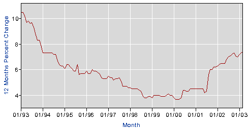
Inflation rates have been moderate in the past decade, always positive, but never reaching 4%, and generally under 3%. However, prices for some categories have behaved differently from the general CPI. Figures 13 through 16 were all made on the Web site of the Bureau of Labor Statistics. Each is for 12-month percent change in prices for every month from January 1993 to January 2003. In order, these graphs represent
- The CPI itself (Figure 13). This graph may be misleading because the vertical axis does not include 0.
- Two utilities used in homes: gas and electricity (Figure 14). Notice that this index is much more volatile than the CPI, varying from –9.3% in February 2002 to 21.6% in January 2001.
- Apparel (Figure 15), which has shown deflation more often than inflation in this period.
- College tuition and fees (Figure 16) -- note that, as was the case with Figure 13, the vertical axis does not include 0. How do the rates in this category compare with the general CPI? Can you think of a reason the vertical axes in Figures 13 and 16 don't include 0?
Figure 13. Consumer Price Index, 12 Month Percent Change.
Chart from Bureau of Labor Statistics. Accessed May 1, 2003.
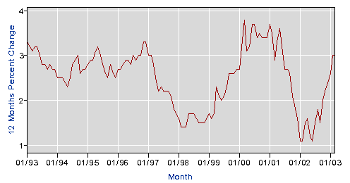
Figure 14. Utility Prices: Gas (piped) and Electricity, 12 Month Percent Change.
Chart from Bureau of Labor Statistics. Accessed May 1, 2003.
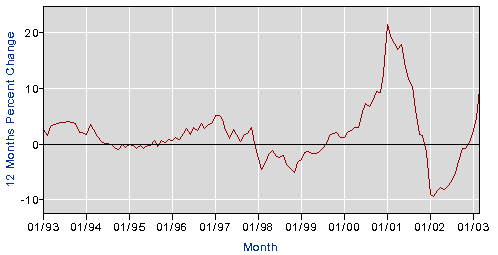
Figure 15. Apparel Prices, 12 Month Percent Change.
Chart from Bureau of Labor Statistics. Accessed May 1, 2003.
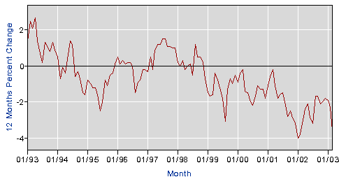
Figure 16. College Tuition and Fees, 12 Month Percent Change.
Chart from Bureau of Labor Statistics. Accessed May 1, 2003.
Try getting these graphs and their data tables yourself. As before, go to www.bls.gov, Get Detailed Statistics, CPI—All Urban Consumers (Current Series), and Create Customized tables (One Screen). Then do these steps:
- Area
- Select one or more items: All items.
- Not Seasonally Adjusted.
- Add to Your Selection.
Now go back to Step 2 and click on Gas (piped) and electricity, then Add to Your Selection. Similarly select Apparel and College tuition and fees. Click Retrieve Data.
Go to More Formatting Options. Use the default time range, which yields the 10 most recent years. (For the current year, the most recent month is used.) Use the default All Time Periods. Uncheck Original Data Value. Check 12 Months Percent Change, include graphs, and Retrieve Data.
The Consumer Price Index and Inflation - Additional Exercises
-
Get a table and graph of the CPI for the last 10 years from the Bureau of Labor Statistics Web site. Follow the steps on Page 2. After selecting More Formatting Options, use the defaults: Original Data Value, Year Range Last 10 Years, and All Time Periods. Check include graphs. You get monthly data. Describe the data for the last 10 years.
-
The Bureau of Labor Statistics calculates a consumer price index for each of several regions in the
-
Make a table showing the annual index for your region, all years.
-
Make a graph like Figure 7. Show the exponential trend curve with its equation and R2. You may wish to include a linear trend line.
-
Compare your graph of the index with a graph created on the Web site.
-
Make a table showing the annual index for your region, all years.
-
In your regional table from Exercise 2, calculate the natural logarithm of the CPI, as on Page 6. Graph it, as in Figure 10. Show the linear trend line in the graph, with its equation and R2.
-
In your regional table from Exercise 2, calculate inflation rates, as on Page 7. Graph them, as in Figure 12.
-
For the inflation rates for your region, get a table and graph from the Web, as on Page 7.
-
The Bureau calculates an index for each of several items. Make a table and graph on the Web site, as on Page 9, to show the 12-month percent changes in price of medical care for the last 10 years. Also get the table and graph for the 12-month percent changes in the general CPI for the last 10 years. How does inflation for medical care compare with the general CPI?
-
What is the average inflation rate from 1970 to 2002? Round your answer to one decimal place. In Exercise 1 you got monthly values for the CPI. What is the most recent value? Use it to estimate the CPI for the current year. Use your table from Page 7 to get the CPI for the year 1990. What is the average inflation rate from 1990 to the present?
-
From your table on Page 7 find the CPI for the years 1992 and 2002. If your salary in 1992 was $5000/month, what monthly salary in 2002 would be equivalent? Calculate and round your answer to the closest cent. Then check with the calculator at the Bureau of Labor Statistics Web site.
-
In Exercise 8 you estimated the CPI for the current year and found the CPI for 1990. What monthly salary now is equivalent to a monthly salary of $6000 in 1990? Calculate -- then check with the calculator on the Web site.
-
If you attend a college or university, find the tuition and fees for the most recent year available and for 10 years ago. Calculate what amount now is equivalent to the tuition and fees 10 years ago. Check by using the inflation calculator on the Web site. Are tuition and fees at your college greater than what you would expect from general inflation?
- The Consumer Price Index is tied to payments for Social Security and some other pensions. Adjustments in the pension payments are called Cost of Living Adjustments (COLA). Write a paragraph or two explaining the relationship. You can research this topic on the Web. Use the Google search engine to search for COLA CPI.
The Consumer Price Index and Inflation - Resources
References
AmosWEB LLC. AmosWEB GLOSS*arama. http://www.amosweb.com/gls/. Accessed March 16, 2003. See in particular the entries “CPI,” “Inflation,” “Deflation,” “Depression,” and “Recession.” Use the Quick Search box as needed.
Haimowitz, J. Assistant Professor of Economics, Avila University, Kansas City, MO. Personal interview, August 29, 2002.
Lynch, P. J., and S. Horton. Web Style Guide, 2002. http://www.webstyleguide.com/. Accessed March 22, 2003. See in particular the section “Typefaces.”
Rossman, A. J. "Integrating Data Analysis and Precalculus," Bridges: The Newsletter for the Workshop Calculus Project, Spring 2003, Dickinson College, Carlisle, PA.
Tufte, E. The visual display of quantitative information. Cheshire, CT.: Graphics Press, 1983. This book has guidelines for legible tables and graphs.
Simpson, J. A., and E.S.C. Weiner, Eds. The Oxford English Dictionary. Oxford: Clarendon Press, 1989.
Helpful Sources
Economics. Danbury, CT.: Grolier Foundation, 2000. This multi-volume work is an encyclopedia of economics with lots of striking graphics. Volume 1, Money, banking, and finance has an article “Inflation and deflation,” pp. 86-87, with a graph of inflation rates for the CPI, energy, new cars, and apparel, all on the same grid. Volume 5, Economic theory, has an article “Consumer price index (CPI),” p. 17. The article “Fiscal policy,” p. 50, states that price stability, meaning inflation rates at most 2%, is a goal of fiscal policy, .
Henderson, D. R., Ed. The concise encyclopedia of economics. http://www.econlib.org/. Accessed March 16, 2003. This is part of the Library of Economics and Liberty, published by the Liberty Fund, Inc. See in particular the article “Inflation” by David Ranson, and search for other economic terms.
Johnson, P. M. A glossary of political economic terms. http://www.auburn.edu/~johnspm/gloss/. Accessed March 16, 2003. See the articles “Deflation,” “Depression,” and “Inflation.”