- About MAA
- Membership
- MAA Publications
- Periodicals
- Blogs
- MAA Book Series
- MAA Press (an imprint of the AMS)
- MAA Notes
- MAA Reviews
- Mathematical Communication
- Information for Libraries
- Author Resources
- Advertise with MAA
- Meetings
- Competitions
- Programs
- Communities
- MAA Sections
- SIGMAA
- MAA Connect
- Students
- MAA Awards
- Awards Booklets
- Writing Awards
- Teaching Awards
- Service Awards
- Research Awards
- Lecture Awards
- Putnam Competition Individual and Team Winners
- D. E. Shaw Group AMC 8 Awards & Certificates
- Maryam Mirzakhani AMC 10 A Awards & Certificates
- Two Sigma AMC 10 B Awards & Certificates
- Jane Street AMC 12 A Awards & Certificates
- Akamai AMC 12 B Awards & Certificates
- High School Teachers
- News
You are here
Seeing and Understanding Data: A Mini-Primary Source Project for Students of Statistics
Mathematicians and scientists included drawings in their work before the first statistical graphs were invented. However, their illustrations were meant to depict quantifiable relationships rather than exposing statistical variability. The uses of pictorial representations or charts to convey trends among variable measurements dates back to at least the late 10th century. However, this means of communication did not gain the widespread appreciation it enjoys today until technological advances in the 21st century stimulated the growth of a new field, data visualization. The mini-Primary Source Project (PSP) Seeing and Understanding Data provides students the opportunity to explore the evolution of statistical graphs and visual displays across time and to think critically about how data are displayed and interpreted.
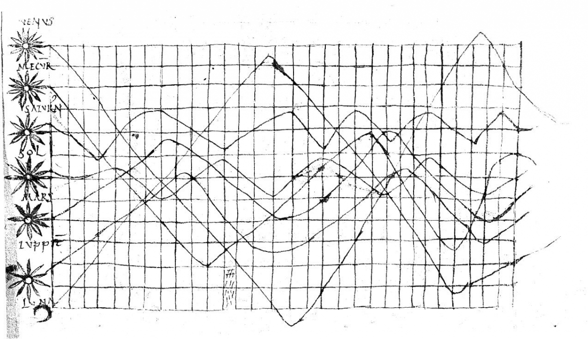
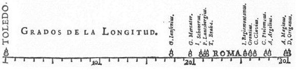
The mini-PSP begins by introducing students to two graphical displays, one from circa 1000 CE (Figure 1) and the other from the mid-15th century (Figure 2), that have features similar to graphs with which they are more familiar. Then, students explore the origins of some now-common statistical graphs in the work of William Playfair (1759–1823), who was apparently the first to publish examples of the pie chart, bar chart, and statistical line chart [Spence & Wainer 2001]. Although Playfair was well-acquainted with major figures of the Scottish Enlightenment, a career checkered by often-illegal activities meant that he and his innovations in communicating data to a general audience remained largely obscure in Great Britain and only slightly better-known in France. It was only in the late 19th century that these graphical methods began to be more widely used by statisticians. (See [Playfair 2005] for a reprint of Playfair’s Commercial and Political Atlas.)
|
|
|
|
In the 19th century, the professional discipline of statistics and visual representations of data often developed in concert. Graphs came to be used not only to illustrate trends or experiments in science, mathematics, economics, and industry, but also to enhance arguments for social reforms. The mini-PSP explores one such instance, the hand-colored displays Florence Nightingale (1820–1910) prepared for her pivotal report to Britain’s Minister of War to show the proportion of deaths from preventable disease during the Crimean War [Stone 2001]. Her dramatic data displays effected changes to all British Army hospitals—changes also incorporated into the U.S. Army hospitals during the American Civil War. Students investigate both the story and the technical aspects of production for this influential visualization, as well as Charles Minard’s equally elegant display of data from Napoleon’s ill-conceived march on Moscow.
The mini-PSP closes with a look at the production of data displays supported by modern technology. Students then use the nine characteristics of graphical excellence espoused by Edward Tufte (b. 1942) to re-examine the primary source visualizations in the project, including the graphs shown in Figures 1 and 2 above and five other seminal graphs:
-
Exports and Imports of Scotland to and from different parts for one Year from Christmas 1780 to Christmas 1781, Bar Graph by William Playfair
-
Statistical Representation of the United States of America, Pie Chart by William Playfair
-
Chart Shewing the Extent, Population & Revenues, of the Principal Nations of Europe in the Order of their Magnitude, Circle Graph by William Playfair
-
Causes of mortality in the Army in the East, Coxcomb Diagram by Florence Nightingale
-
Successive losses of men in the French Army during the Russian Campaign of 1812–1813, Figurative Map by Charles Joseph Minard
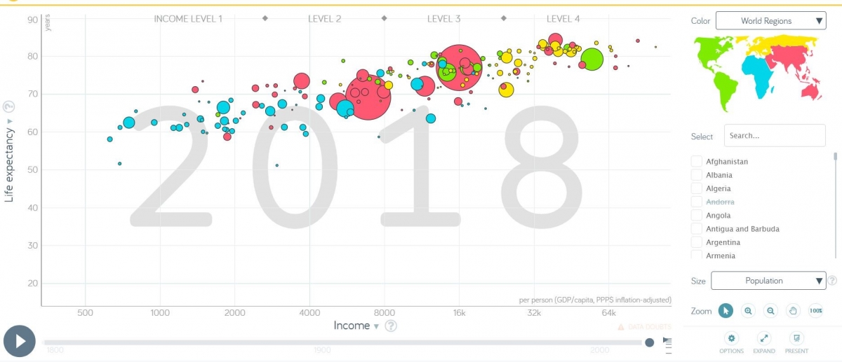
The final project task requires access to the internet (in or out of the classroom) for students to investigate Gapminder’s interactive display of income versus life expectancy data for the whole world over 200 years.
|
|
As Hans Rosling once said, “Most of us need to listen to the music to understand how beautiful it is. But often that’s how we present statistics: we just show the notes, we don’t play the music” [Rosling 2007]. Through this mini-PSP, we hope students see and understand how statistical graphs and data visualizations provide the essential music for how statistics is presented and interpreted by the world. Instructors of introductory statistics and data science courses at the high-school and college levels can implement this project over two-three class periods using a combination of small-group work and whole-class discussion. Some project tasks, especially those requiring use of the internet, also work well as individually-assigned out-of-class work. This mini-PSP is also suitable for mathematics education students, and can be completed by middle school students with more assistance and direction from the instructor.
The complete project Seeing and Understanding Data (pdf) is ready for student use and the LaTeX source code is available from the authors by request. Instructor notes are provided to explain the purpose of the project and guide the instructor through each of the individual sections of the project.
This project is the eighth in A Series of Mini-projects from TRIUMPHS: TRansforming Instruction in Undergraduate Mathematics via Primary Historical Sources appearing in Convergence, for use in courses ranging from first year calculus to analysis, number theory to topology, and more. Links to other mini-PSPs in the series appear below. The full TRIUMPHS collection also includes one other PSP for use in teaching statistics, the full-length project entitled Quantifying Certainty: The p-value.
Acknowledgements
The development of the student project Seeing and Understanding Data has been partially supported by the TRansforming Instruction in Undergraduate Mathematics via Primary Historical Sources (TRIUMPHS) project with funding from the National Science Foundation’s Improving Undergraduate STEM Education Program under Grants No. 1523494, 1523561, 1523747, 1523753, 1523898, 1524065, and 1524098. Any opinions, findings, and conclusions or recommendations expressed in this project are those of the author and do not necessarily reflect the views of the National Science Foundation.
References
Anonymous. 1010. De cursu per zodiacum. https://commons.wikimedia.org/wiki/File:Clm_14436_ecliptic_diagram.png#/, accessed November 2, 2018.
Playfair, William. 2005. The Commercial and Political Atlas and Statistical Breviary. Edited and introduced by Howard Wainer and Ian Spence. New York: Cambridge University Press.
Rosling, Hans. 2007, June. Turning Statistics into Knowledge. Paper presented at the Second OECD World Forum on “Statistics, Knowledge and Policy”, Istanbul, Turkey.
Stone, M. 2001. Florence Nightingale. In Statisticians of the Centuries, edited by C. C. Heyde and E. Seneta, 171–175. New York, NY: Springer-Verlag New York, Inc.
Spence, I., and H. Wainer. 2001. William Playfair. In Statisticians of the Centuries, edited by C. C. Heyde and E. Seneta, 105–110. New York, NY: Springer-Verlag New York, Inc.
van Langren, Michaël Florent. 1643. Graph of statistical data, showing the wide range of estimates of the distance in longitude between Toledo and Rome. https://commons.wikimedia.org/wiki/File:Grados_de_la_Longitud.jpg, accessed November 2, 2018.
Charlotte Bolch (University of Florida) and Beverly Wood (Embry-Riddle Aeronautical University) , "Seeing and Understanding Data: A Mini-Primary Source Project for Students of Statistics," Convergence (December 2018)