- About MAA
- Membership
- MAA Publications
- Periodicals
- Blogs
- MAA Book Series
- MAA Press (an imprint of the AMS)
- MAA Notes
- MAA Reviews
- Mathematical Communication
- Information for Libraries
- Author Resources
- Advertise with MAA
- Meetings
- Competitions
- Programs
- Communities
- MAA Sections
- SIGMAA
- MAA Connect
- Students
- MAA Awards
- Awards Booklets
- Writing Awards
- Teaching Awards
- Service Awards
- Research Awards
- Lecture Awards
- Putnam Competition Individual and Team Winners
- D. E. Shaw Group AMC 8 Awards & Certificates
- Maryam Mirzakhani AMC 10 A Awards & Certificates
- Two Sigma AMC 10 B Awards & Certificates
- Jane Street AMC 12 A Awards & Certificates
- Akamai AMC 12 B Awards & Certificates
- High School Teachers
- News
You are here
The Consumer Price Index and Inflation - Calculate and Graph the Logarithm of the CPI
In the preceding section we observed that the exponential trend curve is determined by doing a linear regression with data points of the form ![]() . We can, of course, do that linear regression directly by taking natural logarithms of the y data. Furthermore, it is often more revealing to work with the logarithm of data than the data itself. The CPI rose from 2.3 in 1913 to 179.9 in 2002, a change of two orders of magnitude. The standard xy-graph does not do justice to the details of change over such a large range. But if we work with logarithms of the CPI, our graph can show details of the entire history. Here is the way to calculate natural logarithms of a data column in Excel:
. We can, of course, do that linear regression directly by taking natural logarithms of the y data. Furthermore, it is often more revealing to work with the logarithm of data than the data itself. The CPI rose from 2.3 in 1913 to 179.9 in 2002, a change of two orders of magnitude. The standard xy-graph does not do justice to the details of change over such a large range. But if we work with logarithms of the CPI, our graph can show details of the entire history. Here is the way to calculate natural logarithms of a data column in Excel:
-
In cell D1 of your current table, write Ln Annual CPI.
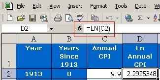
- In cell D2 write = ln (C2). (The = symbol is used for any calculation in Excel.) You should see the result 2.292535, the natural logarithm of 9.9 (the number in cell C2). The formula appears at the top of the worksheet, next to the = sign -- see the red rectangle in Figure 8.
Figure 8. The natural logarithm formula.
-
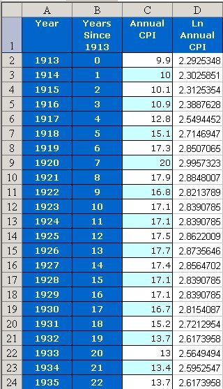
Copy the formula down the page: Click on cell D2. Move the pointer to the lower right corner, so that a cross appears in place of the black box in the lower right corner of Figure 8. Drag the pointer down the column. The natural logarithm is then calculated for cells C3, C4, and so on. The result should look like the table in Figure 9, but extended all the way to the last year in the table.
Figure 9. Logarithms of the Annual CPI data.
To graph the logarithmic data, follow these steps:
-
In the table just made, select Columns B and D: Use the Control key and click Columns B and D. (On a Macintosh computer, use the Apple or Command key.) [If you can't get this to work, click column C and choose Format, Column, and Hide. Then select adjacent Columns B and D with the mouse. You can Unhide Column C when you are done with graphs.]
-
Click the Chart icon, and draw the graph as you did on Page 4.
-
After drawing the graph, click Chart, Add Trendline, Linear.
- Click Options. Select Display R squared value on chart and Display equation on chart. Click OK. The result should resemble Figure 10.
Figure 10. Natural Logarithm of Consumer Price Index and Linear Trend Line

In the preceding section we saw that the exponential trend curve has the formula  . If we take the natural log of the right-hand side of this formula, we find that
 .
.
This last expression is the formula for the regression line in Figure 10 -- which confirms that the exponential trend curve is actually derived from the regression line.
Another way to see a logarithmic plot of the data is to use a logarithmic scale on the vertical axis. To do so, go to the original graph in your worksheet (see Figure 6 or Figure 7). Double-click the vertical axis. Choose Scale and Logarithmic scale
Elizabeth B. Appelbaum, "The Consumer Price Index and Inflation - Calculate and Graph the Logarithm of the CPI," Convergence (December 2004)