The Consumer Price Index and Inflation
Graph Tips
These suggestions are based on Tufte's
book, which has guidelines for legible tables and graphs. A key point, honored
more in the breach than the observance among the public, is that contrasts should
be minimal so that attention is focused on the data. For example, flashy colors
in the background should be avoided. Grid lines should be avoided unless you
need to find values from the graph. Even borders around a legend should be avoided.
As with a mathematical proof, all unnecessary steps are omitted, and the goal
is elegance.
- Double-click on the graph between grid lines -- Format Plot Area
appears. For Area, your choice may depend on whether you intend to
print the graph. If you do, choose a white background, which is more legible
than the default gray background. On a computer screen or overhead projector,
the gray background may be better. Click OK.
- Double-click in the margin outside the graph -- Format Chart Area appears.
Use the Font tab to change the font and increase the point size as
desired. (See the information on fonts in Notes
for the Instructor.) Click OK. Or double-click the title, format
it as desired, then format each axis and the legend.
- Double-click on the curve -- Format Data Series (Trendline), Patterns
appears. Choose Color as desired. If you are going to make black
and white photocopies, use black. For the style of the curve, I have not succeeded
in getting Excel to do anything but the default. If you have more than one
curve, repeat as necessary.
- (Skip this step if you use a gray background or if you intend to make black
and white photocopies.) Double-click on one of the horizontal grid lines.
For color, choose pale gray (-25%). Similarly color the vertical grid lines.
Backgrounds should not be obtrusive.
- Double-click the box containing the legend. You get a Format menu,
Patterns. For Borders, choose None -- distractions
from the data should be avoided.
- Format the axes: Double-click on the y-axis. In Scale,
set the minimum and maximum as desired. The major unit is 20. Set the minor
unit to 5. Show the tic marks for minor units as outside. Similarly,
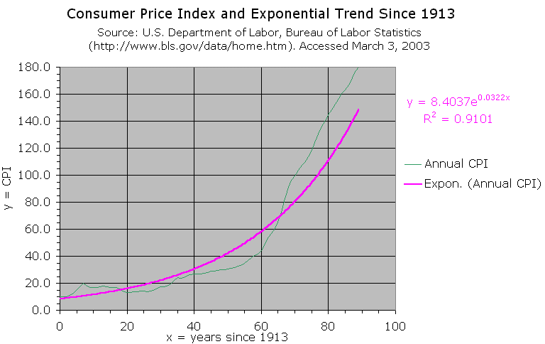
reformat the x-axis. The following figure shows the results of the
changes suggested here and a few others.
To return to the module, close this window.